#40 How Net Liquidity Signals Stock Market Risk Before Price Moves
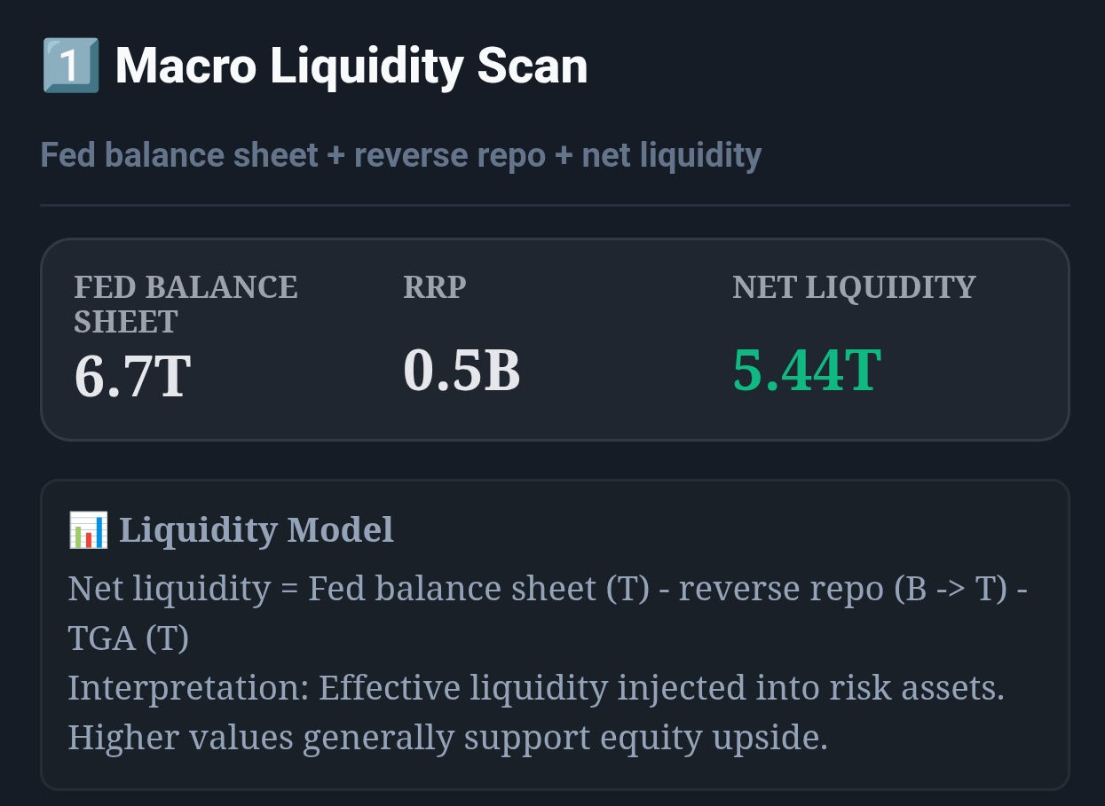
Live capture of Macro Liquidity Scan in Inveflo.
0) Where to Find This Widget
From the main dashboard (12 tiles), open ANALYSIS_2. Use Widget 1: Macro Liquidity Scan (Fed Balance, RRP, TGA, Net Liquidity) as the input for your personal “Risk Thermometer” read: green when liquidity is expanding, yellow when mixed, red when tightening.
1) TL;DR
Instead of juggling four macroeconomic variables (Fed Balance, RRP, TGA, Yield Curve), use a single Risk Thermometer score (0–100) that combines them all. Score > 70 = green (risk-on). 40–70 = yellow (neutral). < 40 = red (risk-off). When the thermometer stays red for 3+ weeks, move to full defensive. When it hits green and stays there, rotate into growth.
2) Hook (Pain-Driven)
I used to manage four separate macroeconomic dashboards—one for Fed balance, one for RRP, one for TGA, one for yield curve. Every week I'd spend 30 minutes cross-checking them, trying to weave a coherent narrative. Half the time I'd miss the inflection point because I was looking at one indicator while another had already flipped. I needed a single number. So I built one.
3) Problem
Macroeconomic indicators are noisy individually. Fed balance sheet can flat-line for weeks, then move $300B in one day. RRP bounces around Treasury operations. Yield curve has false inversions. The real signal emerges only when you see multiple indicators aligned. But most investors can't track that in real time.
4) Solution (Widget Introduction)
The Risk Thermometer is a composite score that weights four inputs:
- Fed Balance Sheet Component (30% weight): Tracks whether the Fed is expanding (loose) or contracting (tight). Higher balance = higher score.
- RRP Momentum Component (30% weight): Captures whether banks are deploying cash (falling RRP = higher score) or hoarding it (rising RRP = lower score).
- TGA Component (20% weight): Monitors Treasury liquidity. High TGA = money out of the system = lower score.
- Yield Curve Component (20% weight): Incorporates 10Y-2Y spread. Steep curve = higher score (risk-on). Inverted = lower score (risk-off).
The score is normalized to 0–100 using 5-year historical percentiles. A score of 50 means you're at the median liquidity condition of the past five years. Scores above 70 are in the top 30% (expansive liquidity). Scores below 40 are in the bottom 30% (tight liquidity).
5) Logic Breakdown (Formula + Thresholds)
Formula: Risk Thermometer Score
RiskThermometer = (FedBal_pct × 0.30) + (RRP_pct × 0.30) + (TGA_pct × 0.20) + (YC_pct × 0.20)
Each component is expressed as a percentile rank (0–100) relative to the past 5 years:
- FedBal_pct: Percentile of current Fed balance sheet vs. 5-year history. 100 = maximum balance ever in past 5 years. 0 = minimum.
- RRP_pct: Inverse percentile of RRP (inverted because high RRP = risk-off). So falling RRP increases RRP_pct.
- TGA_pct: Inverse percentile of TGA (inverted because high TGA = money out = risk-off).
- YC_pct: Percentile of 10Y-2Y spread. 100 = steepest curve in 5 years (risk-on). 0 = most inverted (risk-off).
Thresholds (Color Zones)
| Risk Thermometer Score | Color / Signal | Liquidity Regime | Portfolio Allocation |
|---|---|---|---|
| 70–100 | 🟢 Green (Risk-On) | Expansive. Fed expanding, RRP falling, curve steep. | 70% growth (QQQ, small-cap), 20% bonds, 10% gold. |
| 50–69 | 🟡 Yellow (Warm / Neutral) | Mixed. Some tailwinds, some headwinds. | 50% growth, 40% bonds, 10% gold. Balanced. |
| 30–49 | 🟠 Orange (Caution) | Tightening. Fed shrinking, RRP rising, curve flattening. | 30% growth, 60% bonds, 10% gold. Defensive rotation. |
| 0–29 | 🔴 Red (Risk-Off) | Tight liquidity. Major headwinds building. | 10% growth, 70% bonds (TLT), 20% gold. Full defensive. |
6) Practical Use (IF X → THEN Y)
Scenario 1: Score Drops from 65 (Yellow) to 35 (Orange/Red) in 3 Weeks
- Signal: Rapid tightening. Fed shrinking the balance sheet quickly, RRP spiking, yield curve flattening.
- Market Impact: Growth stocks roll over. S&P 500 sells off 8–15%. Small-cap and QQQ underperform by 20%.
- Action: Immediate. Rotate 50% of growth positions into bonds (TLT, AGG). Reduce QQQ by half. Buy put options on QQQ/Russell 2000.
- Horizon: Hold defensive until score stabilizes above 40 for 2 weeks (sign of capitulation).
Scenario 2: Score Rises from 35 (Red) to 55 (Yellow) over 4 Weeks
- Signal: Liquidity improving. Fed stabilizing, RRP falling, curve steepening.
- Market Impact: Growth stocks stabilize. Breadth expands. Rally begins.
- Action: Rotate 20% from bonds back into growth. Watch for score to break above 60 (full green signal).
- Horizon: If score breaks above 70, rotate 50% more into growth. Set a trailing stop at 50 (yellow zone).
Scenario 3: Score Stays at 72 (Deep Green) for 6+ Weeks
- Signal: Extremely loose liquidity. This is the environment for 20%+ rallies in growth.
- Market Impact: QQQ and small-cap massively outperform. Leverage works. Weakness is bought instantly.
- Action: Increase growth to 80% of portfolio. Add leverage via margin or options. Reduce gold (no inflation concerns in this regime).
- Risk: Watch for any dip below 70. That's your first warning sign.
7) Common Mistakes
Mistake #1: Overweighting Single Components
You might notice that Fed balance sheet is expanding, so you assume it's all green. But if RRP is spiking and the curve is inverting, the thermometer could still be orange/red. The composite score catches what individual indicators miss.
Mistake #2: Reacting to One-Week Swings
The thermometer can swing 5–10 points in a single week due to Treasury operations or month-end flows. Always use 2-week rolling averages. Look for scores that hold steady above or below a threshold for 2+ weeks before acting.
Mistake #3: Ignoring the Historical Context (Percentiles)
A Fed balance sheet of $7.2T is meaningless without knowing if it's at the 90th percentile (expansive) or the 30th percentile (contractionary) of the past 5 years. The thermometer does this calculation for you—trust the percentile, not the absolute number.
Mistake #4: Using the Thermometer as a Crystal Ball
A score of 75 (green) doesn't guarantee the S&P 500 will rally this week. It says that the structural conditions favor risk-on positioning. Tactical weakness can still happen. Use the thermometer for strategic allocation, not for predicting daily moves.
Q: Why weight components equally (with Fed/RRP at 30% each)?
Fed balance sheet and RRP are the two most direct measures of banking system liquidity. TGA and yield curve are secondary (they influence liquidity but aren't direct measures). The 30-30-20-20 split balances giving Fed/RRP the leading role while capturing the secondary signals. You can adjust weights based on your own backtests.
Q: What happens to the thermometer during a flash crash or VIX spike?
The thermometer won't react immediately because Fed balance sheet and RRP update only daily/weekly. But the yield curve might flatten intraday. Within 1–2 days, if the flash crash prompts Fed action (RRP injections, balance sheet expansion), the thermometer will adjust. The key: the thermometer is designed to smooth out daily noise and capture the macroeconomic shift.
Q: Can I trade the thermometer on shorter timeframes (days/weeks)?
Yes, but not directly. Use the thermometer to set your strategic allocation (growth/bond mix), then use technical indicators (RSI, MACD) to pick daily/weekly entry points within that allocation framework. The thermometer is the forest; technical indicators are the trees.
Q: What if two components conflict (e.g., Fed expanding but RRP spiking)?
That's exactly what the composite score handles. If Fed balance is at the 80th percentile (bullish) but RRP is at the 20th percentile (bearish), the thermometer might land at 55 (neutral/yellow). This conflict signal is actually valuable—it tells you that liquidity conditions are mixed and you should avoid aggressive positioning.
CTA: Open ARK Tracker
Review ARK flow, top adds, top trims, and allocation changes directly in the ARK dashboard.